WestJet’s new UltraBasic fare

From WestJet.com:

Starting today, WestJet is introducing its newest fare offering, UltraBasic. Replacing the Basic fare offering, UltraBasic is WestJet’s lowest priced option and has been designed as a no-frills fare that gives guests the choice to add certain extras like reserving a seat in advance or adding a checked bag.

It is a basic economy fare with a different name. Seat is auto-assigned, no carry-ons allowed (personal item is allowed), and passengers will be the last to board. It is really their old Basic fare with a new name and no carry-on bag allowed.

United’s Latest App Update is a Visual Flop

The United iPhone (and Android) app, in my opinion, has been one of the better airline apps on the market. For one, it historically has been a native application, not a web view like Delta or Alaska’s apps, making it faster to respond and return information. The United app has also been a really good case study in information design and presentation; It is extremely easy to find what you’re looking for, from flight status information to searching for new flights to looking for your account details.

Over the last few years United has started straying from the design philosophies that really set their app apart. They have started using web views in certain areas of the application and have complicated what were once simple views. However, all of those were changes that didn’t reduce a user’s ability to use the app.

But today they released a new version and it is a bit of a mess. Most of the changes are cosmetic but the impact really hits some of what made the application usable.

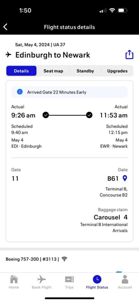
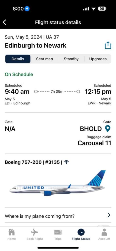
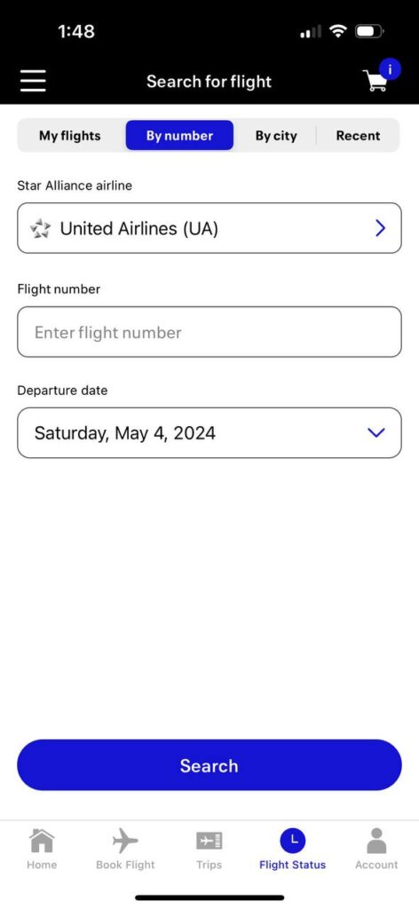
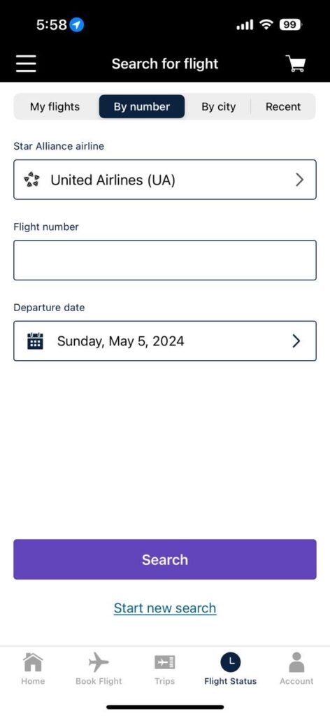
Take for example these two screenshots:

The first screenshot is the new version of the app while the second screenshot is the previous version. They both show the same screen, the flight status information (granted, for different days for the same flight number). The amount of wasted space in the screenshot on the left is really frustrating. The user is forced to scroll the page to see further details, when that information could be displayed in the available space.

They have also made some font and color choices that I find questionable. The overall font on the app has changed and has become smaller and harder to read.


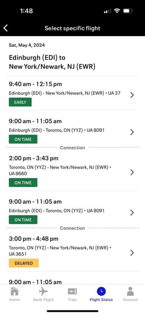
This is the flight status search results screen. Again, the new app is on the left, the old one on the right. I can see that they were trying to establish some form of application flow by moving the arrow to select the flight to the right but they have again used this new font at a smaller size and it is extremely hard to read. It almost feels like the kerning is off on the text.


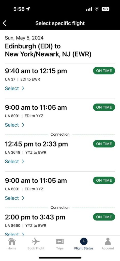
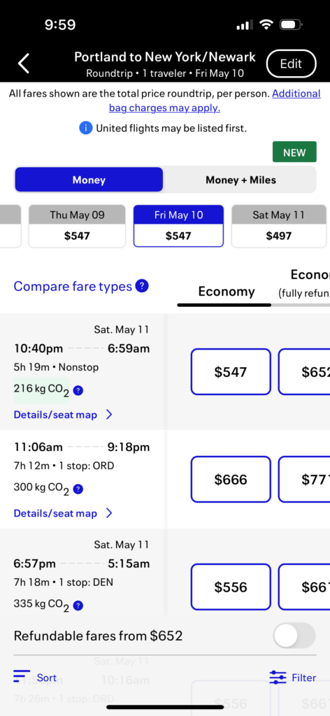
Lastly is their choice of this blue. I know it’s part of their new branding but it is really, really hard on the eyes and it is everywhere. Mixed with the new font there are some places in the app where I have to look away to let my eyes focus. And can we talk about the pointless whitespace? Even in the old app there was too much, but they added more.

Part of me wonders if this is some new template with a new font family that someone in the United design department liked and just ran with it or if they actually did any user testing of the new user interface at all.

These flight results have the new bright blue everywhere. Paired with the new font, it just isn’t great to look at. When looking at a phone screen you have to strain your eyes because of the way the font is smaller and the bright blue clashes with the white background.

I really hope United reconsiders these changes. The font could probably stay if the kerning is adjusted and the overall size is increased. I think that’s actually my biggest complaint is that it was a larger font that has seen a size decrease with the new font. The native app font size should be adequate for most users to read easily without having to zoom in via the iPhone’s accessibility features.

United has long touted their app as the industry leader for helping travelers navigate their trip and book new trips but this latest update really hinders usability and ease of use.

What is happening with United reward prices?

From Live and Let’s Fly:

As flagged by Chazza in a comment on Live And Let’s Fly, Lufthansa redemption rates have risen from 121K to 154K one-way between the USA and Europe. Even more alarmingly, ANA redemption rates have risen from 121K to 242K one-way between the US and Japan, a devaluation of 100%. The change was effective April 24, 2024.

While initial searches Seats.Aero suggested some differences in pricing, it is now clear that all prices have risen for both transpacific and transatlantic first class awards.

The whole post is worth a read but the gist is that it seems United has made some award price changes, in some cases a 100% increase in the number of miles needed for a long haul first class award. There have also been other reports of coach award prices on partners going up as well. In addition to this, the above linked post mentions there are dates with the lower prices still available and that’s what I have been seeing as well. This leads me to think that this is actually dynamic pricing being tweaked or fully implemented for partners.

I don’t love these higher numbers but with the peddling of credit cards around every corner and every “influencer” sharing how they got a crazy expensive vacation on points these higher prices were bound to happen. If you are a frequent traveler and look for rewards you may have noticed that it’s harder to find premium space, specifically business class, on a lot of long haul routes. With so many credit cards being marketed to people and the number of points in people’s accounts going up, the airlines are sort of forced to raise reward prices to try and remove those new outstanding miles from their liability sheet.

This is as good of a time as any to remind you, spend the miles when you have them, they are not accruing interest nor are they gaining value.

In case you missed it, you can support me by buying me a coffee.

Great Read on the Anatomy of a Credit Card Rewards Program

Anatomy of a credit card rewards program

This is… far less incentive compatible for you, particularly if you decided that the business of manufacturing books-dollars was so lucrative that you could rebate more than the direct interchange revenue given mix effects. These users will have blended costs very close to your headline number, not to your modeled blended costs.

These users will even band into tribes, find each other on the Internet, and swap tips for exploiting poor, defenseless credit card program managers like yourself. The tribal elders will eventually run businesses, with names like The Points Guy, which eventually get quietly acquired by very sophisticated private equity firms. Those PE firms are betting that you continue paying generous per-signup affiliate commissions to Internet properties which send you new card users. You bet you will also paying tens of millions of dollars annually to Frequently Adversely Selected New Accounts Dot Com. And Redditors bet they will continue chortling that they have pulled one over on you, because haha, you’re not nearly as good as they are at fourth grade math or keeping spreadsheets.

There are some real great insights in this piece by an advisor to Stripe, a huge financial infrastructure provider and credit card processor. One that stood out to me was Chase going to Visa to create a new product to compete with American Express. We also talk about it a bit in the Patreon supporter part of the Dots, Lines, and Destinations podcast Episode 478.

One thing that is public but not well appreciated: Chase didn’t just decide to create an extremely lucrative-for-the-customer offering out of the goodness of their hearts and out of their own P&L. No, they pitched Visa on this idea. For too long, Visa, you have watched your competitor American Express outcompete every issuer in the Visa system for the best wallets in the world. They can do that because they can afford to, because American Express charges systematically higher interchange rates than Visa does even at its topmost tier. Visa, you should create a new tier where your not-exactly-chosen champions can try to spend those interchange dollars to give American Express a run for their money.

It’s definitely a long piece but well worth reading.

Renting an EV for the first time

During a recent work trip to Florida that required a rental car, the rental agency only had EVs available and because I didn’t want to sit around waiting for another vehicle, I took it. Overall it wasn’t a bad experience, but I can see why Hertz struggles with electric vehicles.

The EV I received was a Mercedes Benz EQB. I had zero issues with the quality of the car, it’s a Mercedes, it was nice, comfortable, and well appointed. These days I mostly care about CarPlay and this Mercedes checked that box for me.

When receiving the details from the rental agent I asked bluntly, “how much do I need to charge the vehicle before returning it?” to which he replied, “it needs to be at 70% of whatever its current charge level is”. When I started the car it was 40% charged, giving me a little under 100 miles of range. That’s unacceptable in my opinion. If I had needed to drive somewhere out of that range I would’ve had to immediately make my way to a charging station (more about that later) to charge before continuing my trip.

In addition, this particular rental company, Avis, had no notation of the charge of the vehicle on the rental slip. The fuel level simply showed 8/8, which with a 40% charge, was not true.

I had never driven a EV, so I took lap around the parking lot to get a feel for it before hitting the road. The single pedal driving setup was definitely a shift in thinking and by the end of the trip it felt a little better but I certainly wasn’t an expert. Once on the road the car felt very good and the acceleration was fantastic, making getting on the freeway and performing passing maneuvers super easy.

When I made it to the hotel I asked if they had a charging station but was disappointed to learn there was nothing on-premise and actually nothing that close so I started texting friends asking how they know where to charge their EVs when they’re on the road. The answer seemed to be PlugShare or ChargeHub, both of which I downloaded and started searching. I don’t know if it’s a data problem or a Florida problem but both apps seemed to be lacking a lot of useful information when it came to any type of charger besides Tesla.

As an aside, I also tried the car’s built-in charger app and it was subpar, suggesting charging stations that were much further away (maybe they were fast chargers).

I finally found a charger near the venue I would be attending my work event and drove over the next day to get a charge. Thankfully there was no other EV there as it was the only charger. The actual charging station experience leaves a lot to be desired. This particular charger was a Blink charging station and when I first got it all setup it seemed like it required a Blink membership to even use but after circumventing some of the prompts I was able to get it to charge. The charging process was by no means fast, I dropped the car off at 8am and it did not charge to 100% from ~45% until 3:30pm. It also wasn’t particularly cheap at $19.35 for 39.49 kWh of power or $.49/kWh.

The rental companies could do a better job with explaining charging as well, especially since vehicles can be configured to only charge to a certain point, such as 80%.

The return process was also very interesting. The attendant who checks the mileage and the fuel level in standard combustion vehicles couldn’t figure out how to do either of those things in the EV. I explained where the charge level was but I never saw him find the mileage on the car and when I checked my statement the car was notated to have fewer miles than when I left the rental lot.

Overall I didn’t have too much trouble with renting an EV but rental companies need to get better at how they communicate the process and should probably update their systems to accommodate EV specific information. It would probably help if the rental companies stuck with a handful of brands of EVs rather than buying whatever they can when they can. The charging experience is also less than stellar. Again, maybe it’s a Florida thing but the data on the chargers just seems to be bad. This could be another area where the rental companies work with the EV companies to customize the built-in mapping software to help renters find the charger they need when they need it. All in all I thought it was fun to be able to try out an EV and see what they’re like to drive. Given my travel driving habits, I don’t think I’d hesitate to rent another one.