
The United iPhone (and Android) app, in my opinion, has been one of the better airline apps on the market. For one, it historically has been a native application, not a web view like Delta or Alaska’s apps, making it faster to respond and return information. The United app has also been a really good case study in information design and presentation; It is extremely easy to find what you’re looking for, from flight status information to searching for new flights to looking for your account details.
Over the last few years United has started straying from the design philosophies that really set their app apart. They have started using web views in certain areas of the application and have complicated what were once simple views. However, all of those were changes that didn’t reduce a user’s ability to use the app.
But today they released a new version and it is a bit of a mess. Most of the changes are cosmetic but the impact really hits some of what made the application usable.
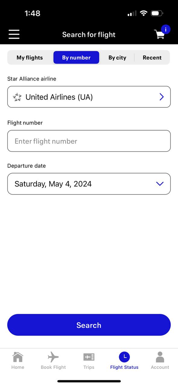
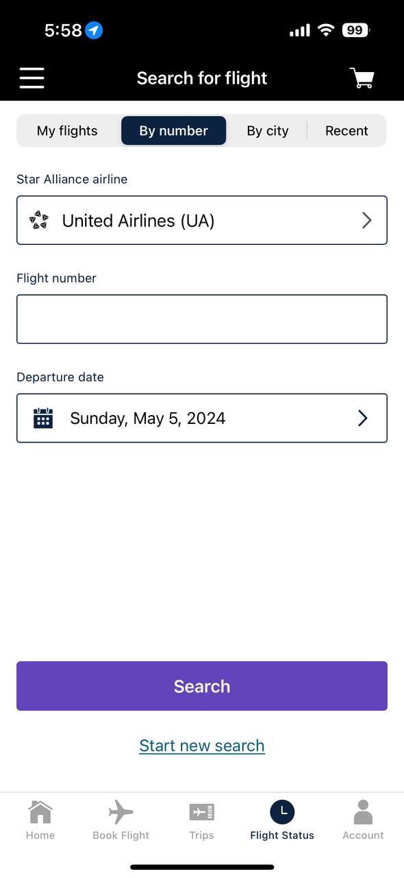
Take for example these two screenshots:
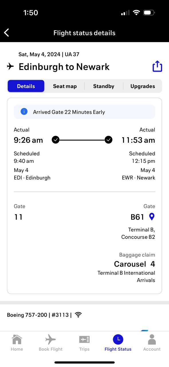
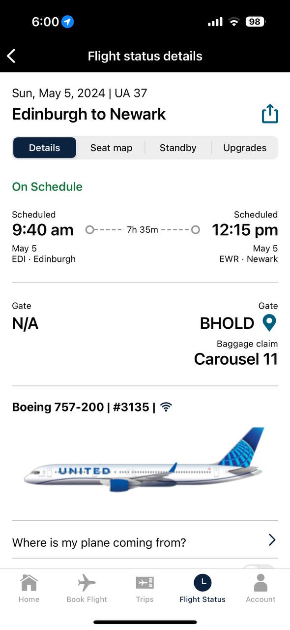
The first screenshot is the new version of the app while the second screenshot is the previous version. They both show the same screen, the flight status information (granted, for different days for the same flight number). The amount of wasted space in the screenshot on the left is really frustrating. The user is forced to scroll the page to see further details, when that information could be displayed in the available space.
They have also made some font and color choices that I find questionable. The overall font on the app has changed and has become smaller and harder to read.
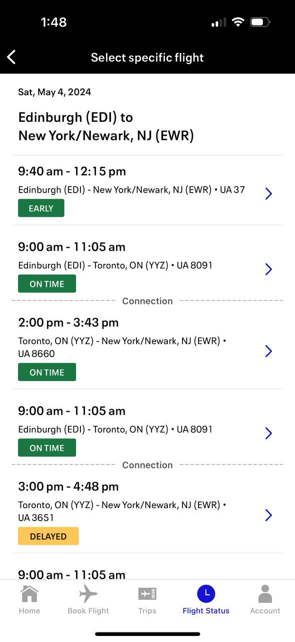
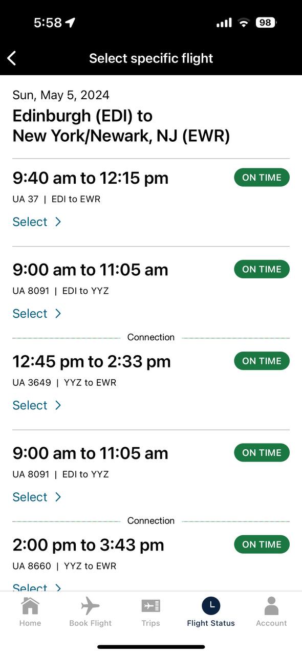
This is the flight status search results screen. Again, the new app is on the left, the old one on the right. I can see that they were trying to establish some form of application flow by moving the arrow to select the flight to the right but they have again used this new font at a smaller size and it is extremely hard to read. It almost feels like the kerning is off on the text.
Lastly is their choice of this blue. I know it’s part of their new branding but it is really, really hard on the eyes and it is everywhere. Mixed with the new font there are some places in the app where I have to look away to let my eyes focus. And can we talk about the pointless whitespace? Even in the old app there was too much, but they added more.
Part of me wonders if this is some new template with a new font family that someone in the United design department liked and just ran with it or if they actually did any user testing of the new user interface at all.
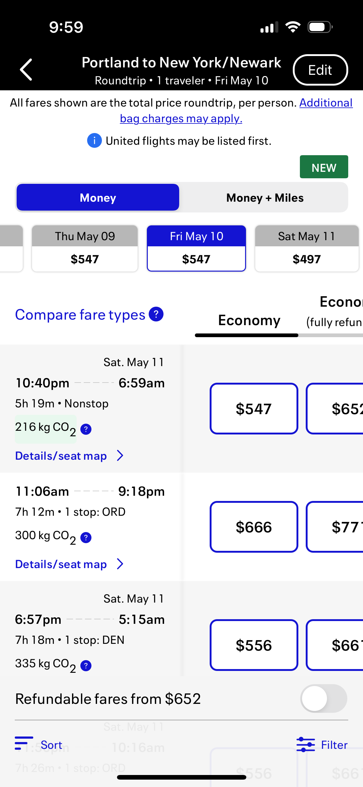
These flight results have the new bright blue everywhere. Paired with the new font, it just isn’t great to look at. When looking at a phone screen you have to strain your eyes because of the way the font is smaller and the bright blue clashes with the white background.
I really hope United reconsiders these changes. The font could probably stay if the kerning is adjusted and the overall size is increased. I think that’s actually my biggest complaint is that it was a larger font that has seen a size decrease with the new font. The native app font size should be adequate for most users to read easily without having to zoom in via the iPhone’s accessibility features.
United has long touted their app as the industry leader for helping travelers navigate their trip and book new trips but this latest update really hinders usability and ease of use.
Tiny fonts are the bane of my existance. Tiny fonts on cell phones are even worse. Tiny fonts on cell phones when I have a briefcase over my shoulder, well, that means I have to stop, manually increase the size of my screen and scroll through to find what I need. Not a good idea.
I have been using the United app for many years. In the past few months it is impossible to view. The font is smaller and more less bold. There is too much clutter on a page. This is very unfriendly to the user why were these changes made?