This past weekend I had the opportunity to participate in Portland International Airport’s “dress rehearsal” for the opening of the newly built main terminal building. The building has been under construction since early 2021 and with this phase, a big portion of the airport will reopen, reducing a lot of the check-in desk congestion that is present today. The dress rehearsal was to help the airport, the airlines, and TSA make sure that things were operating as expected and to work out any major hiccups before the terminal officially opens on August 14. I believe over 1,000 participants signed up.
All participants had to register before entering the space and this process was a bit painful as it meant waiting in the parking garage in a very long line. The bottleneck seemed to be that they were doing a quick orientation of around 75 people before releasing them into the terminal. To me, this seemed problematic from a realism perspective as the waves of people during the morning rush can be well into the 200-300. Each person received a script that let them know what airline they were flying, whether or not they were checking bags, the security line they needed to go through (PreCheck, express, or regular), and how they were checking in (app or website, kiosk, or with an agent).
The Nitty Gritty
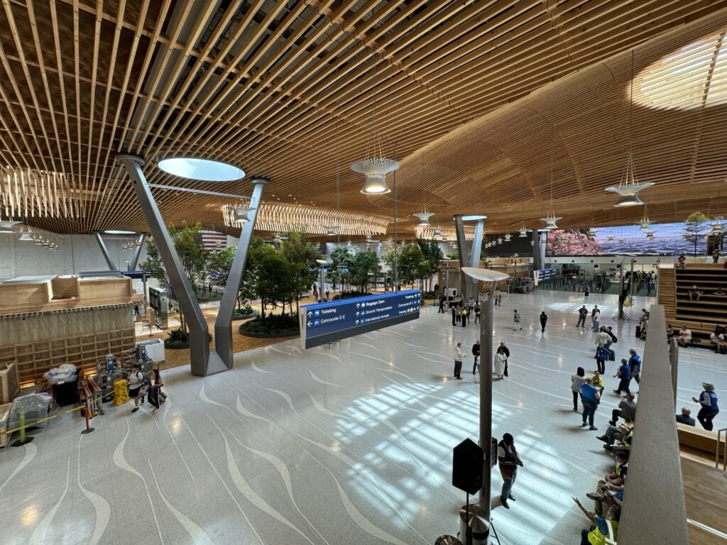
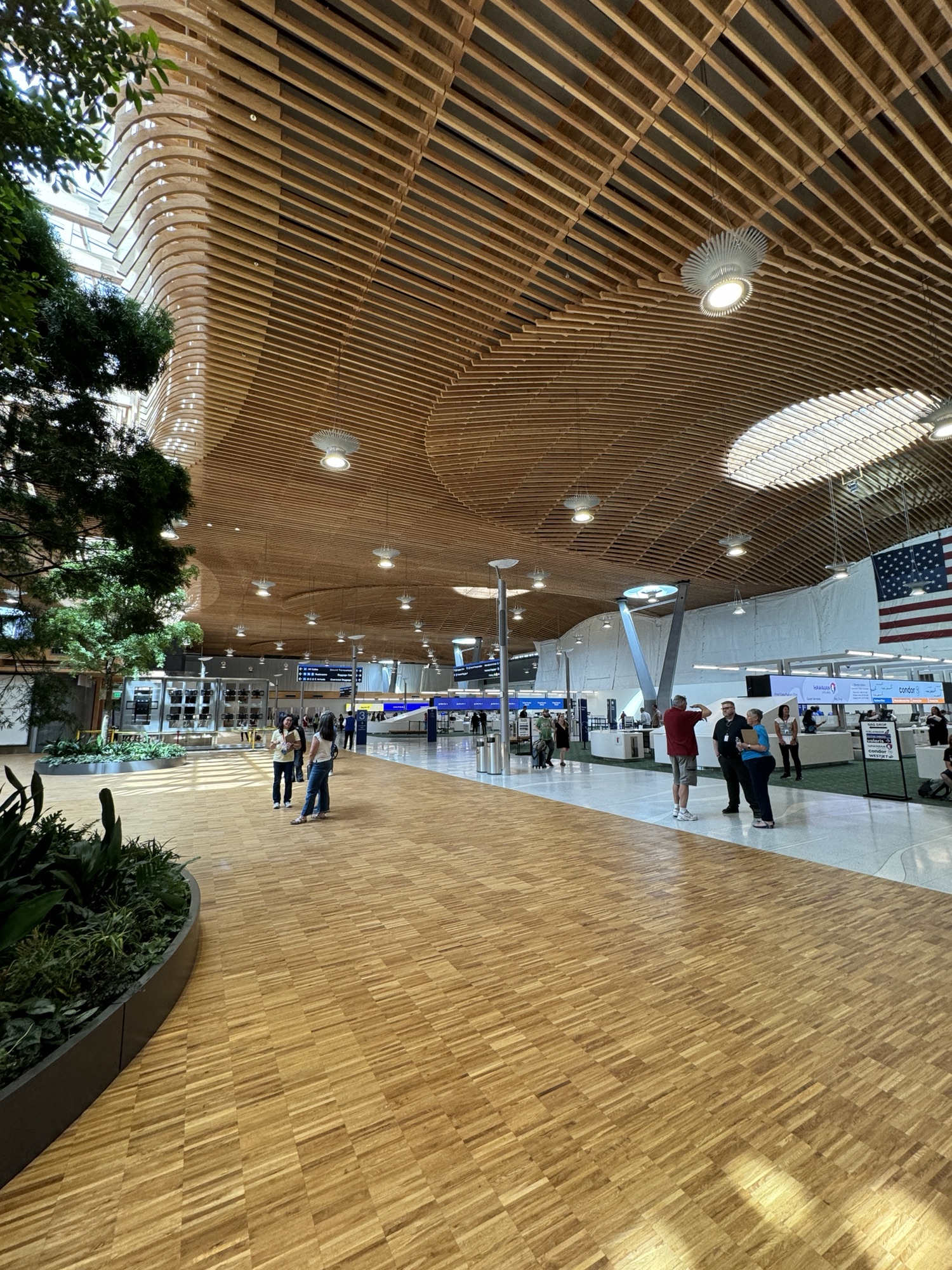
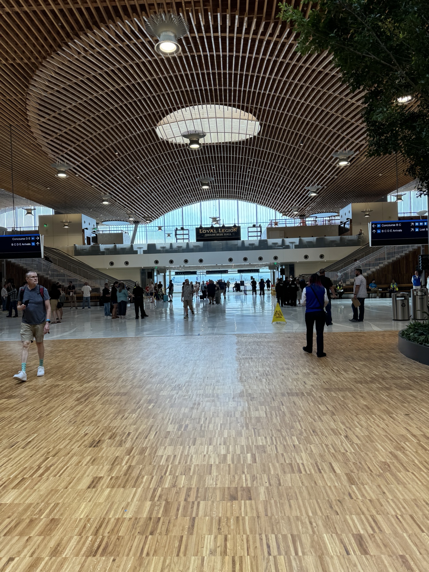
The terminal is beautiful, no doubt about it. On the right in this photo is the temporary wall that blocks the current check-in area from the new space. Then there are the new check-in areas. They are long open areas giving plenty of space for travelers to maneuver, even if an airline’s queues are long. Then you reach the wooden floor and a large opening in the ceiling letting a ton of natural light fill the space.
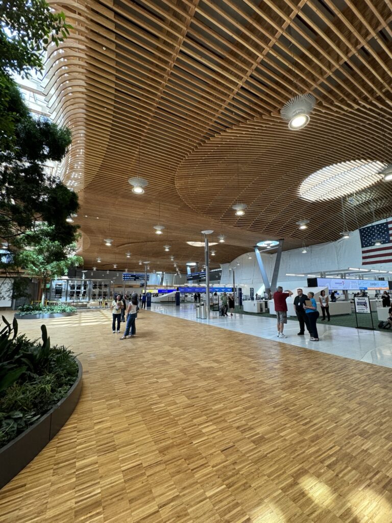
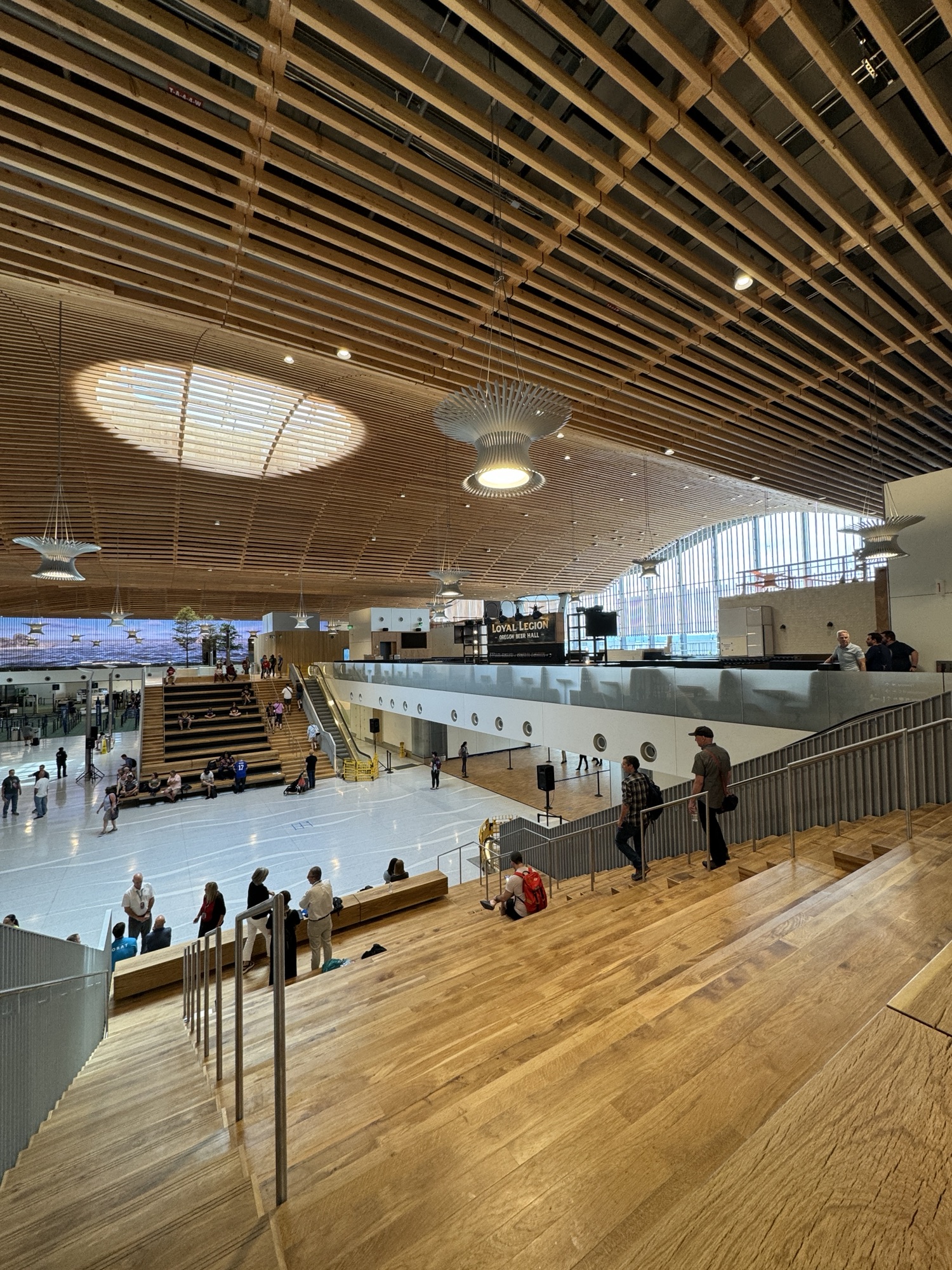
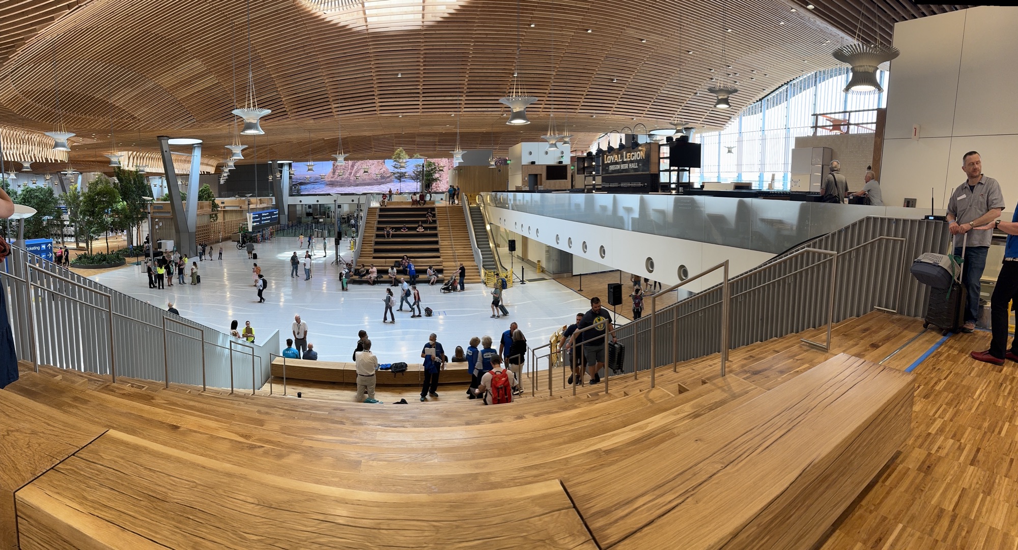
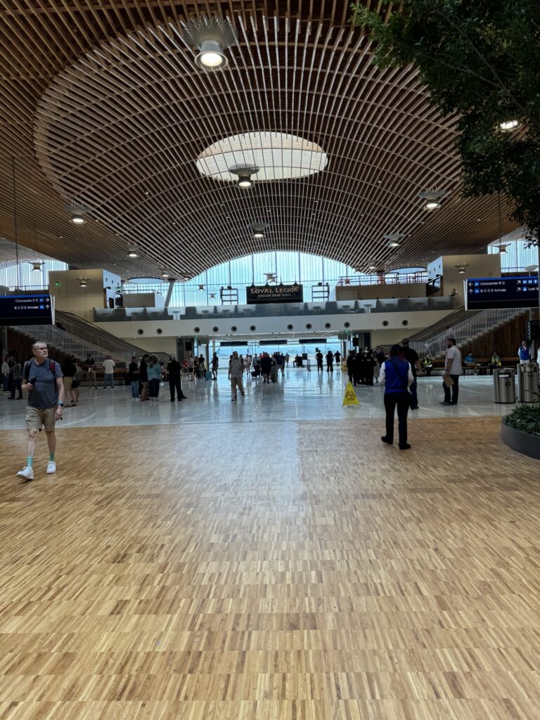
The wooden floors lead to a tiled space and here you are facing west. There are stadium seats (more on that later) that face the area where passengers will exit the secure area after their flights. In the next picture the security checkpoints are to the right and left of the center of the photo.
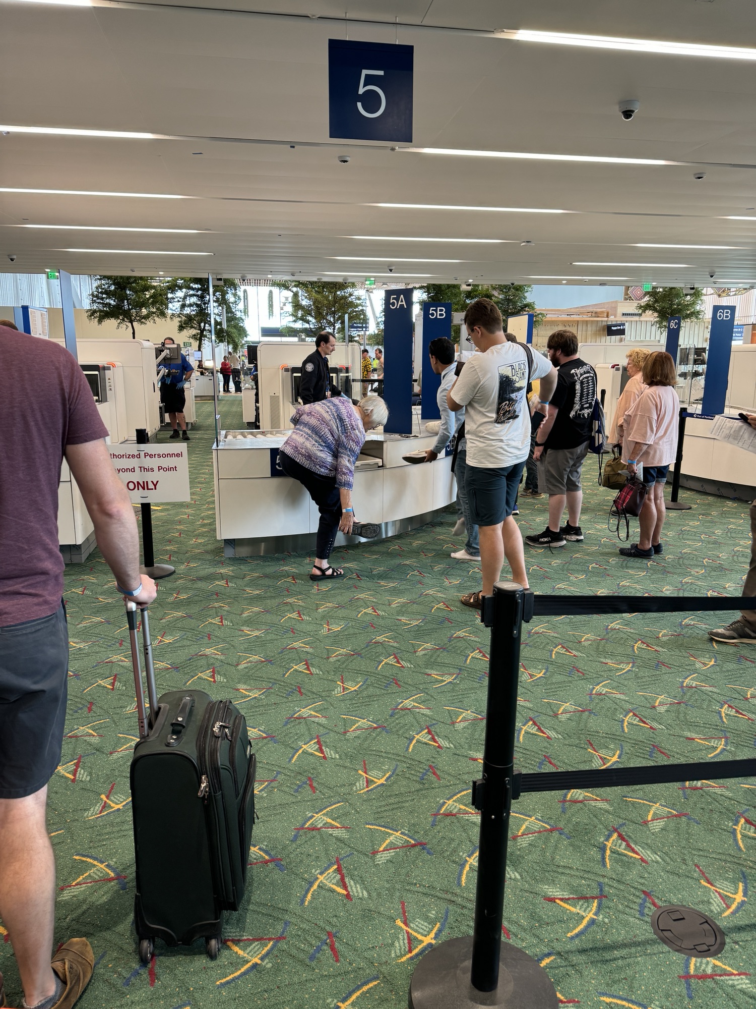
The security checkpoints are where some of my qualms with the design start to become apparent. Each security lane, or spot where there is a body scanner, has three places where passengers can line up to fill the plastic bins with their luggage, shoes, toiletries, etc. This is marked with the lane number and a letter (5A/B/C in the next photo), but there is zero explanation of what this means. As you can see, people were kind of bunching up. This will speed up people going through the I.D. check but will probably cause some frustration as people try to jockey for the next open bin space. I’m not sure how to solve it but I brought it to the airport staff’s attention as well as the TSA’s, so maybe they’ll come up with something in the next couple of weeks.

After you go through security you are in a new atrium area that will lead to the old terminal hallways, so no big changes there.
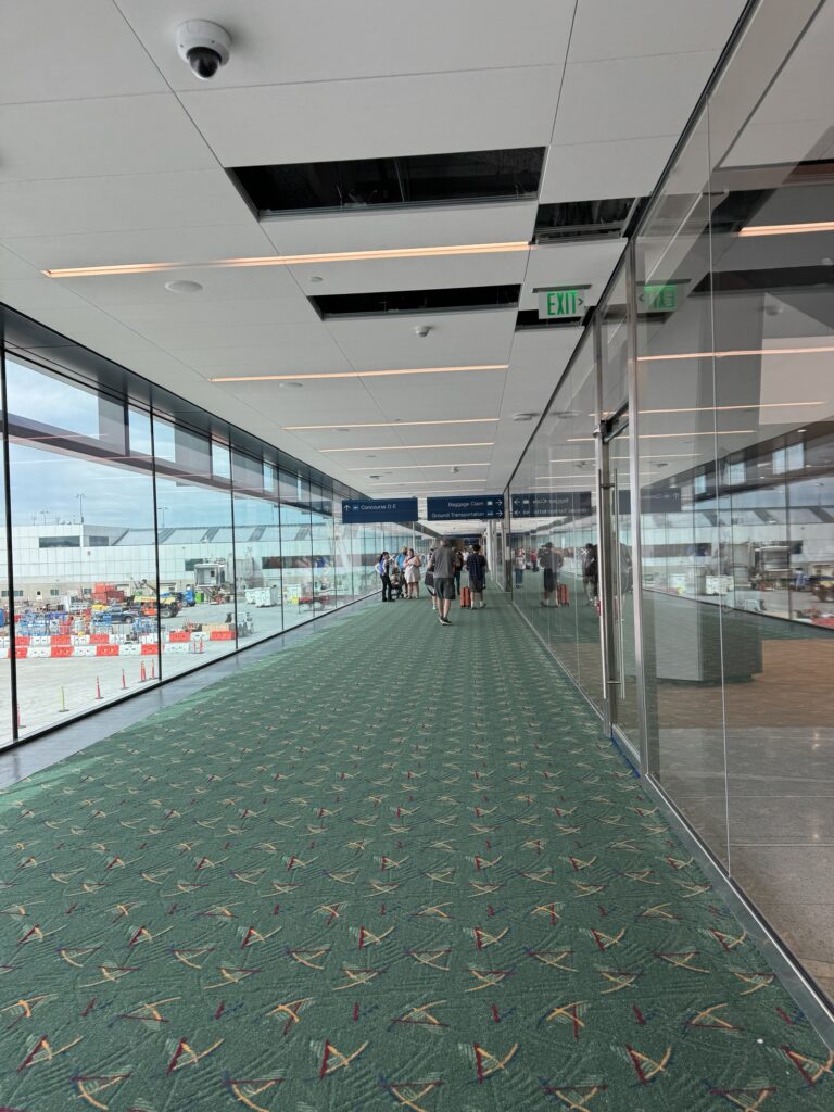
But, the good news for travelers is that the secure connector hallway between B/C and D/E terminals will reopen when the terminal reopens! This will be a huge help to passengers who are connecting between some of the airlines that interline and codeshare out of PDX. The downside is that this hallway is now contains the singular exit for all passengers. I’ve been told this is temporary until phase II of the airport is completed, so hopefully that is true. The other downside is that the connector hallway no longer has moving walkways nor the chairs that it used to have. If I had a flight delay I would typically grab a coffee, sit in those chairs, and enjoy the views of the airport operations. My guess is that the hallway is too narrow now and putting chairs in would just impede traffic.
Now, back to those stadium seats. These seats face the single terminal exit. There is going to be a lot of traffic around this area with people waiting for their friends and family to arrive. I’m sure Loyal Legion will do great business but do you notice that glass partition between the booth and the area above the terminal exit? It’s definitely not high enough to prevent a child (or adult) from tossing things down onto the heads of people exiting after their flight.
I also don’t love the lack of backs on the seating in the area but it is an improvement to the current waiting areas for families, which is essentially 5-6 seats at each of the two exits.


Overall the space is a huge improvement. The amount of natural light alone is a massive upgrade to what the old check-in area, security checkpoints, and waiting area were like. This new pre-security departure hall offers lots of open space for passengers and passenger’s family/friends to wait. And the concessions and stores that disappeared during the construction, we’re getting those back and some new ones, like Loyal Legion, outside of security that everyone can enjoy. What do you think of the new terminal?