The user experience is awful

The user experience is awful

I can sum up this post in a sentence: The overall experience for customers has degraded over time and is, in my opinion, the worst it has ever been.

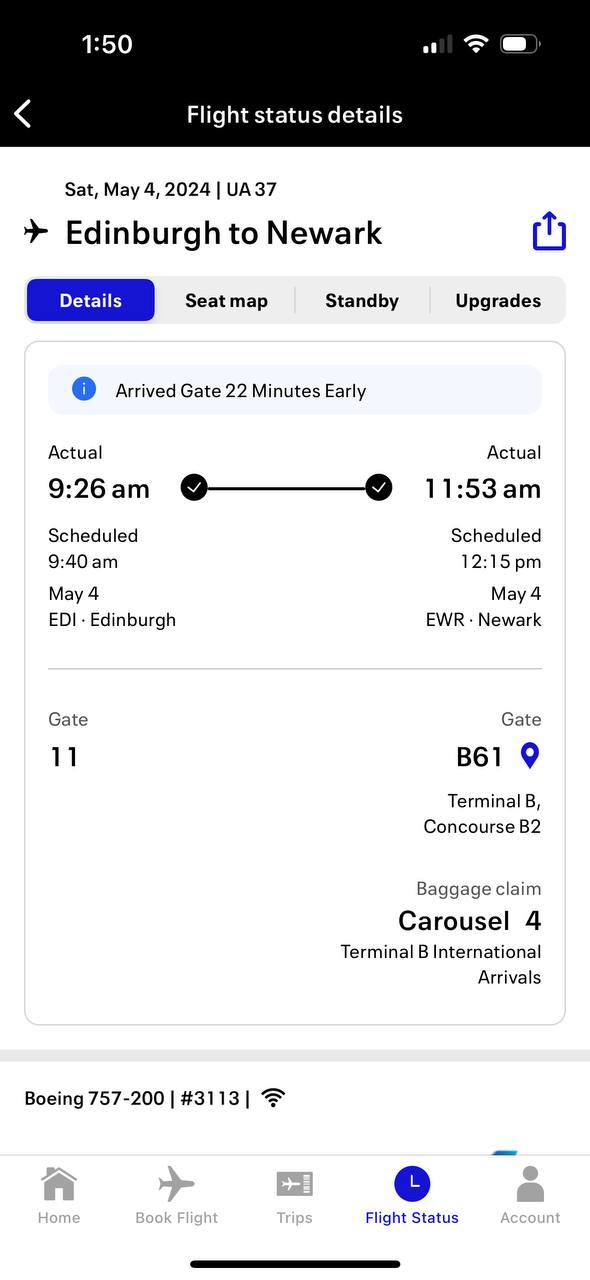
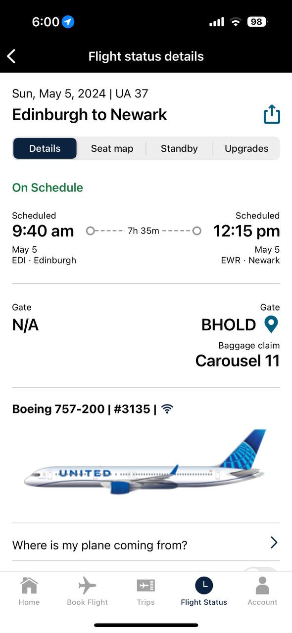
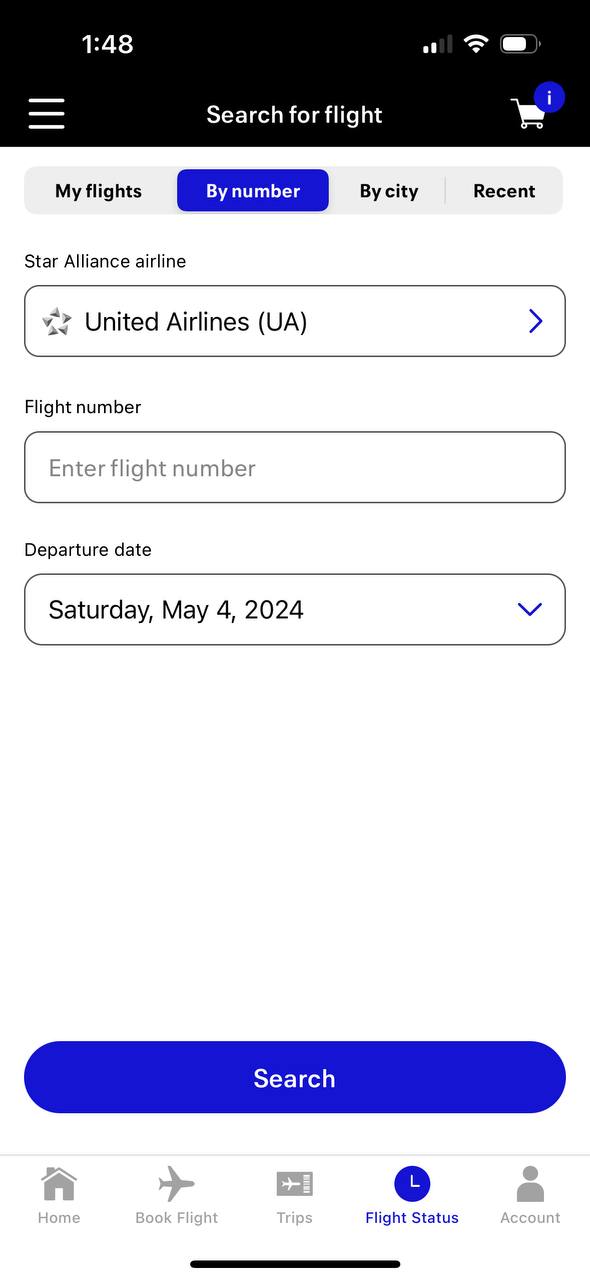
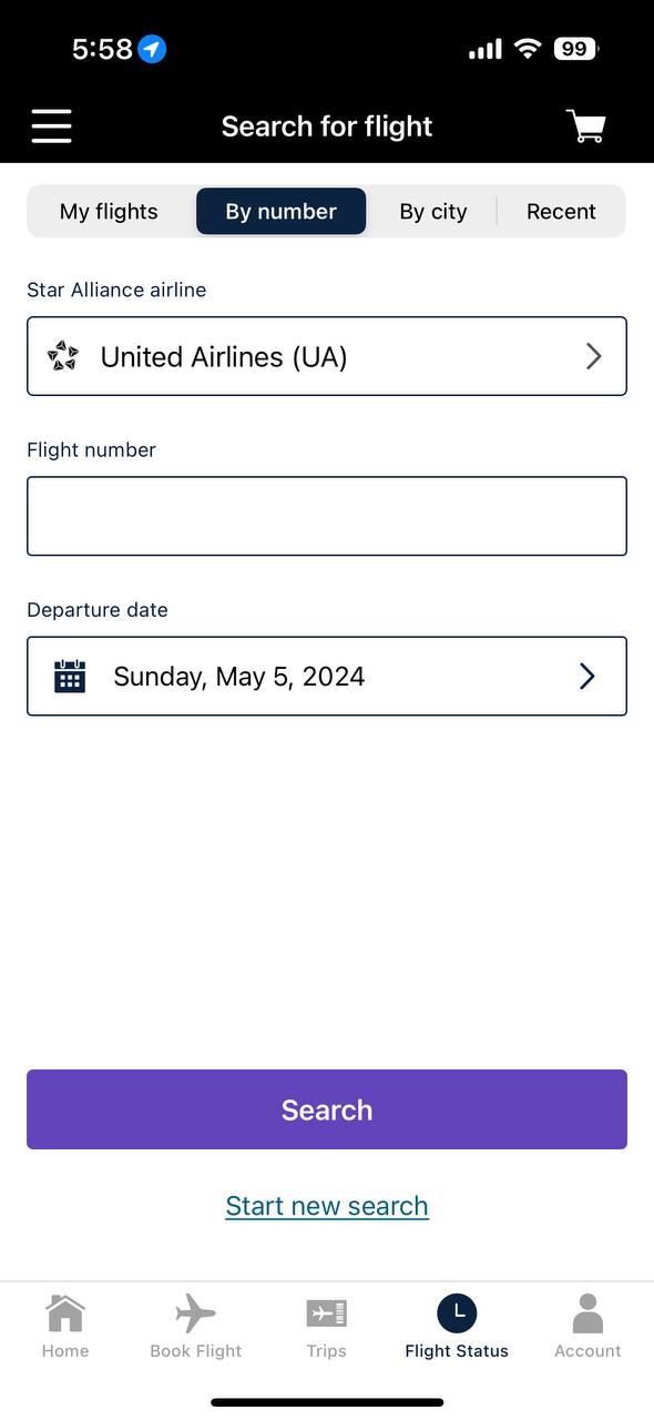
Need to talk to an airline representative during a delay or cancellation? Good luck. They will direct you to use their app’s chat feature that uses “AI” and 45-minutes later your issue still won’t be solved and you will be asking to speak to an actual person.

Have a question about your healthcare bill? Go through ten different phone trees to finally get a human who tells you you’re talking to the wrong department. After you are finally talking to the correct person they realize that you were billed incorrectly and it will take months for a new bill to be generated and in the meantime your current bill won’t be properly voided and instead sent to collections. You will be sorting this out for months.

Visiting the grocery store and have a full basket? The store will attempt to force you to use self-checkout where inevitably some of the items refuse to scan and require an employee to come over anyway, making the entire checkout process take longer. It also seems like this isn’t always a hiring problem but a cost issue; Grocery store margins aren’t amazing, so anything a store can do to lower costs, they’ll do. You the customer pay the price with your time (and sanity).

I could list more examples and I’m sure you could share your own, the point is the same, the overall customer and user experience for the interactions we need to have on a daily basis continue to be awful. And it isn’t that the interactions are necessarily bad, it’s that there are so many friction points. Some of it feels intentional, put you in what feels like an endless queue, hoping you drop, while other parts feel like no one has actually thought about it being a problem.

The sad part is, I don’t know that the experience gets better in my lifetime. It feels like we’ve just been so conditioned to put up with these annoyances that they aren’t going to be clawed back, we will just put up with them, complain about them, and move on (see this post).

Tuesday texts to read – 7

Tuesday texts to read – 6

Tuesday texts to read – 5

Alaska Airlines asked for a 3-hour ground stop

Alaska Airlines asked for a 3-hour ground stop

Yesterday, July 20, 2025, Alaska Airlines asked the FAA for a ground stop for all of their flights starting around 8pm Pacific. There were rumors of a hack, but the airlines has not confirmed or denied that claim. There was a report that the airline suffered a hack back in June but again, there is no information pointing to it being a cause of this latest issue. Whatever the cause, the ground stop lasted until 11pm Pacific and it’s clear the effects on operations will be felt by the airline for at least the next couple of days.

If you have a flight on Alaska over the next few days, be prepared for irritated customers and potential delays as the airline tries to get crews back into place and recover from the issue.

My favorite portable battery for travel

I have carried portable batteries when traveling for a while, but back in 2020, just before Covid, I was trying to lighten my carry-on and it made me realize how heavy the Anker portable battery I had was. Sure, it could recharge my phone three times, but it also weighed a few pounds.

Fast forward to 2023 and I was starting to travel again and in the market for a lightweight battery. I came across the Nitecore NB10000 Gen 2. It is a super lightweight 10000mAh battery, smaller than my iPhone but still able to give me two full charges. The shell of the battery is carbon fiber so I don’t have to worry about it getting punctured or bent and damaging the battery.

Nitecore 10000

Nitecore now has a Gen 3 version of the battery that has two USB-C output ports instead of one USB-C and one USB-A.

*Disclaimer, the links above lead to Amazon and I receive compensation if you buy the product with that link. If you would like to purchase directly from Nitecore with no affiliate benefit to me, you can do that here.

Common Vulnerabilities and Exposures database funding ending

From The Register

The 25-year-old CVE program plays a huge role in vulnerability management. It is responsible overseeing the assignment and organizing of unique CVE ID numbers, such as CVE-2014-0160 and CVE-2017-5754, for specific vulnerabilities, in this case OpenSSL’s Heartbleed and Intel’s Meltdown, so that when referring to particular flaws and patches, everyone is agreed on exactly what we’re all talking about.

It is used by companies big and small, developers, researchers, the public sector, and more as the primary system for identifying and squashing bugs. When multiple people find the same hole, CVEs are useful for ensuring everyone is working toward that one specific issue.


It basically works like this: When an individual researcher or an organization discovers a new bug in some product, a CVE program partner — there are currently a few hundred across 40 countries — is asked to assess the vulnerability report and assign a unique CVE identifier for the flaw if and as necessary.

The program is sponsored, and largely funded by the Cybersecurity and Infrastructure Security Agency, aka CISA, under the umbrella of the US Department of Homeland Security. It appears MITRE has been paid roughly $30 million since 2023 to run CVE and associated programs.


This funding ended last week. Keeping developers informed about vulnerabilities in a central location is a national security issue as well as a business issue. If your product is exploited and costs you money as a business owner is one thing, but if the thing that was exploited was a tool that other companies use as well, then the exploit could be expanded and impact huge swaths of the U.S. economy, see Heartbleed.

AT&T’s huge data breach

From TechCrunch

U.S. phone giant AT&T confirmed Friday it will begin notifying millions of consumers about a fresh data breach that allowed cybercriminals to steal the phone records of “nearly all” of its customers, a company spokesperson told TechCrunch.


Some of the stolen records include cell site identification numbers associated with phone calls and text messages, information that can be used to determine the approximate location of where a call was made or text message sent.

In all, the phone giant said it will notify around 110 million AT&T customers of the data breach, company spokesperson Andrea Huguely told TechCrunch.

It seems like Snowflake, a cloud based data analytics company, is the likely source of the breach. These types of breaches are becoming more and more common, with third parties who offer some sort of service, have poor or unchecked security practices. If you are an AT&T customer just keep an eye on your account and consider changing your password or passcode.

The hacking of culture

From Bruce Schneier and Kim Córdova

Tech companies want us to believe that algorithmically determined content is effectively neutral: that it merely reflects the user’s behavior and tastes back at them. In 2021, Instagram head Adam Mosseri wrote a post on the company’s blog entitled “Shedding More Light on How Instagram Works.” A similar window into TikTok’s functioning was provided by journalist Ben Smith in his article “How TikTok Reads Your Mind.” Both pieces boil down to roughly the same idea: “We use complicated math to give you more of what your behavior shows us you really like.”


Our digitized global economy has made us all participants in the international data trade, however reluctantly. Though we are aware of the privacy invasions and social costs of digital platforms, we nevertheless participate in these systems because we feel as though we have no alternative—which itself is partly the result of tech monopolies and the lack of competition.

 
It does feel like it’s nearly impossible to avoid some of the social media and digital platforms. I’ve managed to completely avoid TikTok but things like Instagram and Twitter I still check regularly, even though I would rather not. There’s definitely a FOMO element to it, but there is also a bit of empty time that these apps fill. Almost like a digital nicotine.

United’s Latest App Update is a Visual Flop

The United iPhone (and Android) app, in my opinion, has been one of the better airline apps on the market. For one, it historically has been a native application, not a web view like Delta or Alaska’s apps, making it faster to respond and return information. The United app has also been a really good case study in information design and presentation; It is extremely easy to find what you’re looking for, from flight status information to searching for new flights to looking for your account details.

Over the last few years United has started straying from the design philosophies that really set their app apart. They have started using web views in certain areas of the application and have complicated what were once simple views. However, all of those were changes that didn’t reduce a user’s ability to use the app.

But today they released a new version and it is a bit of a mess. Most of the changes are cosmetic but the impact really hits some of what made the application usable.

Take for example these two screenshots:

The first screenshot is the new version of the app while the second screenshot is the previous version. They both show the same screen, the flight status information (granted, for different days for the same flight number). The amount of wasted space in the screenshot on the left is really frustrating. The user is forced to scroll the page to see further details, when that information could be displayed in the available space.

They have also made some font and color choices that I find questionable. The overall font on the app has changed and has become smaller and harder to read.


This is the flight status search results screen. Again, the new app is on the left, the old one on the right. I can see that they were trying to establish some form of application flow by moving the arrow to select the flight to the right but they have again used this new font at a smaller size and it is extremely hard to read. It almost feels like the kerning is off on the text.


Lastly is their choice of this blue. I know it’s part of their new branding but it is really, really hard on the eyes and it is everywhere. Mixed with the new font there are some places in the app where I have to look away to let my eyes focus. And can we talk about the pointless whitespace? Even in the old app there was too much, but they added more.

Part of me wonders if this is some new template with a new font family that someone in the United design department liked and just ran with it or if they actually did any user testing of the new user interface at all.

These flight results have the new bright blue everywhere. Paired with the new font, it just isn’t great to look at. When looking at a phone screen you have to strain your eyes because of the way the font is smaller and the bright blue clashes with the white background.

I really hope United reconsiders these changes. The font could probably stay if the kerning is adjusted and the overall size is increased. I think that’s actually my biggest complaint is that it was a larger font that has seen a size decrease with the new font. The native app font size should be adequate for most users to read easily without having to zoom in via the iPhone’s accessibility features.

United has long touted their app as the industry leader for helping travelers navigate their trip and book new trips but this latest update really hinders usability and ease of use.