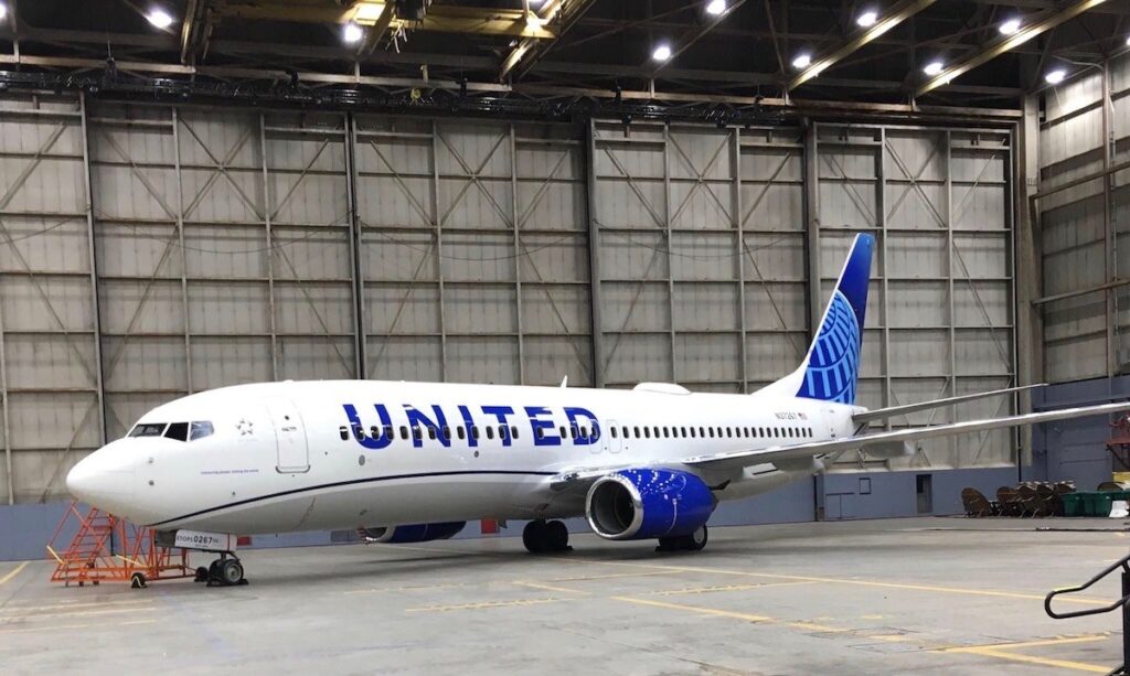
Images of United’s new livery hit the internet last night before the official “reveal” today in Chicago. The new paint scheme drops the gold elements from the look and replaces them with different blues.

For all the hype that United was trying to generate around the new livery, overall it appears like a very minor change done poorly. Here are some quick thoughts:
- The “logo” is still the globe, just simplified. United and their partners in this branding had a chance to re-imagine the globe and give us something new, but for whatever reason, they doubled down on it.
- The blue looks “cheap”. The particular blue that United chose for their name and around the engines has a tone to it that looks odd. Maybe it is the light in the hanger, but the color seems like something I’d see on a bad ad for hair care products.
- There is a ton of white. The look is minimalist but it seems overly so.
- There is nothing that stands out. I think this is the thing that bothers me the most. There was a real opportunity to do something interesting and new but United went the opposite direction, playing it as safe as they could while getting a “new” look.
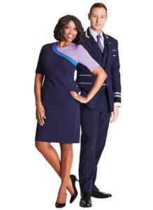
There was a large release by United a while back on new uniforms, onboard amenities, etc. that incorporated plum and other hues of purple and it is disappointing that with the new livery they steered clear of including those colors. At the end of the day though, it is just paint. I fly inside of the plane. What I would really like to see is United focus on their soft product and customer service. Start delivering on those things and I think people will forget what colors are painted on the plane and just remember it by the name and the service they receive.

What do you think?
