Paint Me Unimpressed

Images of United’s new livery hit the internet last night before the official “reveal” today in Chicago. The new paint scheme drops the gold elements from the look and replaces them with different blues.


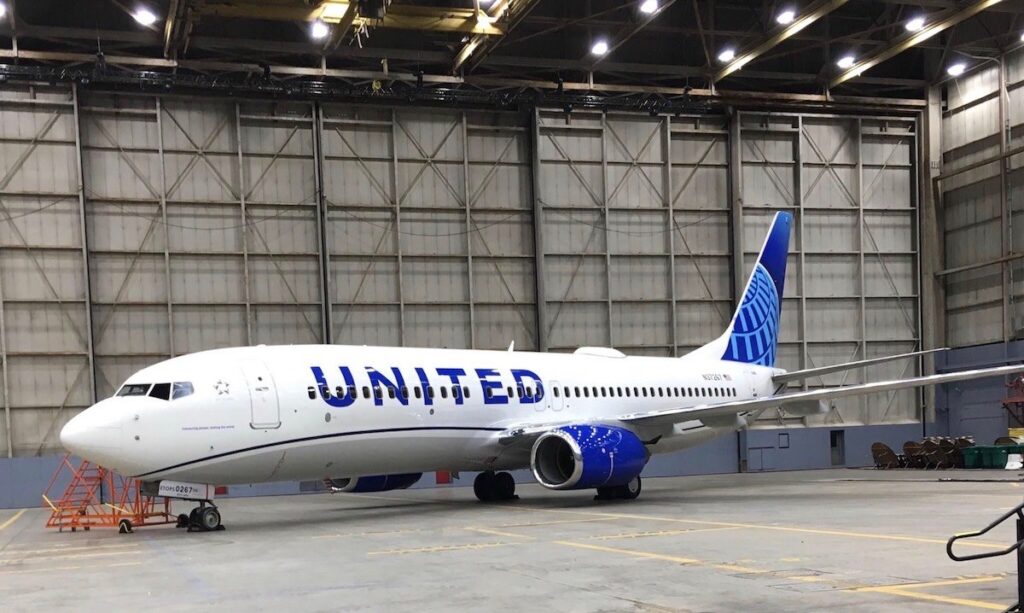
For all the hype that United was trying to generate around the new livery, overall it appears like a very minor change done poorly. Here are some quick thoughts:

  1. The “logo” is still the globe, just simplified. United and their partners in this branding had a chance to re-imagine the globe and give us something new, but for whatever reason, they doubled down on it.
  2. The blue looks “cheap”. The particular blue that United chose for their name and around the engines has a tone to it that looks odd. Maybe it is the light in the hanger, but the color seems like something I’d see on a bad ad for hair care products.
  3. There is a ton of white. The look is minimalist but it seems overly so.
  4. There is nothing that stands out. I think this is the thing that bothers me the most. There was a real opportunity to do something interesting and new but United went the opposite direction, playing it as safe as they could while getting a “new” look.

There was a large release by United a while back on new uniforms, onboard amenities, etc. that incorporated plum and other hues of purple and it is disappointing that with the new livery they steered clear of including those colors. At the end of the day though, it is just paint. I fly inside of the plane. What I would really like to see is United focus on their soft product and customer service. Start delivering on those things and I think people will forget what colors are painted on the plane and just remember it by the name and the service they receive.

What do you think?

Alaska’s New Brand

Alaska Airlines, arguably the hometown airline of Seattle, Portland, and Anchorage, unveiled a their new brand and livery at an event yesterday in Seattle.

new_alaska_livery
In a blog post, they give details on why they are refreshing the brand and a few insights into why they went the direction they did.

“We’ve added 90 new markets in the past five years. As we continue to grow, we are updating the outward expression of our brand so it shows up bolder wherever we fly.”

Essentially, we now fly Boston to San Diego non-stop and want to make our logo simpler for that market. I get it, it is not like they were going to change the name of the airline or anything. The first thing that stands out to me though is how close the new tail livery looks to some of the low cost carriers and how the entire livery looks a little Southwest-ish. The second thing is what I pointed out to Seth yesterday, the multicolored cheat lines look like the engines are spewing out the Northern Lights.

southwestlivery

Maybe that’s what Alaska was going for. The colors also match up pretty well to the Seattle Seahawks, the Mariners, and Sound Transit System. Coincidence?

I am no branding or livery expert but I just find the new look to be less Alaska and more Spirit/Southwest/Frontier. Maybe that is what they were going for. There is even a hint of Eurowings in there. There is a pretty great breakdown of the entire brand, livery, and other customer facing materials at Under Consideration. Their impression? Underwhelmed.

Overall, it’s not a highly inspiring redesign and rather than double-down on the quirkiness and ruggedness of the brand equity established they have moved away to safer territory.

Maybe Alaska should have gone to an all retro livery… (to be fair, some of the colors do match up)

old_alaska

— Updated at 12:30pm PST

I should add, if employees like the new look and it motivates them to better serve customers, then I am all for it. From the video of the unveiling of the new brand it does seem like the employees are excited about it and that’s a good thing.

Southwest Heart

Southwest unveiled their new livery this morning and while I am not a huge fan of the font or the colors, it seems they really thought about unifying their look. The bubble font is what bothers me the most. I thought bubble fonts were dead and we all said “good riddance”. I guess not.

A new commercial accompanied the livery unveiling and it’s a different marketing approach from previous Southwest spots and I like what they did. They talk about their customers, their commitment and how much their employees matter.